Moving Your Truss Plant Off Spreadsheets Without Losing a Week
Spreadsheets got your plant this far. Here's how to move to something better in stages, without a big-bang switchover or a lost week.
4 min read
Software that works fine at a desk often fails on the shop floor. Here's what makes a tool usable for people with gloves, noise and no time to spare.
Most business software is designed at a desk, for a desk. Then it's taken onto the shop floor and handed to people wearing gloves, standing next to a running saw, with a forklift waiting. Unsurprisingly, it often doesn't get used. The data it was supposed to collect never arrives, and the office goes back to walking the floor with a clipboard.
Tools that work on the shop floor share some clear traits. This article describes them, so you can recognize them when choosing software, or ask for them when it's being built.
Nearly everyone in a plant already carries a smartphone. Tools that work well on a phone can be used anywhere: at the table, in the yard, on the truck. Tools designed for a big monitor and squeezed onto a phone are frustrating, with tiny text, sideways scrolling and buttons too close together.
"Mobile-first" means the phone layout is the starting point, and larger screens get more room rather than the other way round. In practice, that means:
On the floor, people tap with gloves, dirty fingers or in a hurry. Small, crowded buttons cause mistakes. Accessibility guidelines commonly recommend touch targets of at least 44 by 44 pixels; for the shop floor, bigger is better. Equally important is having fewer buttons: if a screen offers ten choices, people hesitate or tap the wrong one.
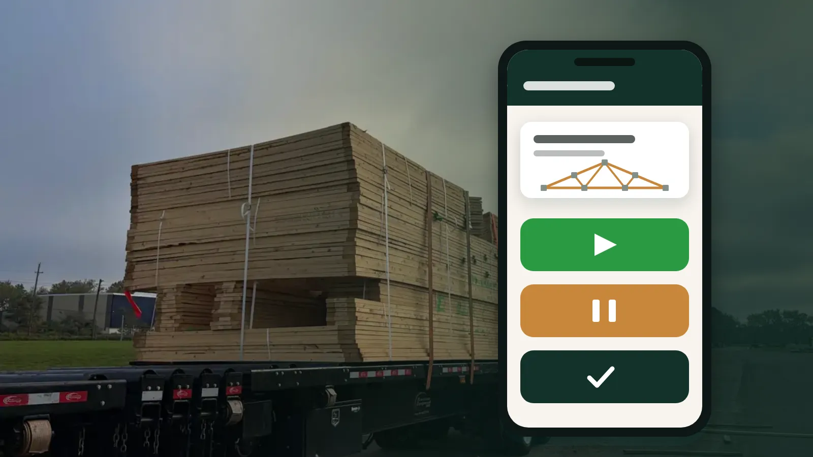
The best shop-floor screens do one job. A crew screen for tracking batches might need only three actions: Start, Pause and Done.
Passwords are a major barrier on the floor. People forget them, share them or write them on the side of the table. For tasks that are low-risk and single-purpose, like recording that a batch has started, a dedicated link is often better than a login: open it, and it does exactly one job. It can't see costs, change jobs or manage people.
Keep personal logins for the office and anyone who can make bigger changes. (See Who should see what for how to split access.)
Labels on shop-floor screens should use the words crews already use. "Start batch" beats "Initiate production event". Short, plain words are faster to read and easier for everyone, including people working in a second language.
Shop floors have glare, dust, vibration and noise. Design for them:
Wi-Fi coverage in a plant is rarely perfect. Steel buildings, metal racks and long yards create dead spots. Good shop-floor tools cope: they load quickly, keep working for a moment if the signal drops, and make it obvious when something hasn't been saved. Nothing frustrates a crew more than tapping Done and wondering whether it counted.
When someone taps a button, the screen should respond immediately and clearly: the batch shows as started, the timer runs, the colour changes. If there's any doubt about whether an action worked, people tap again, or stop trusting the tool.
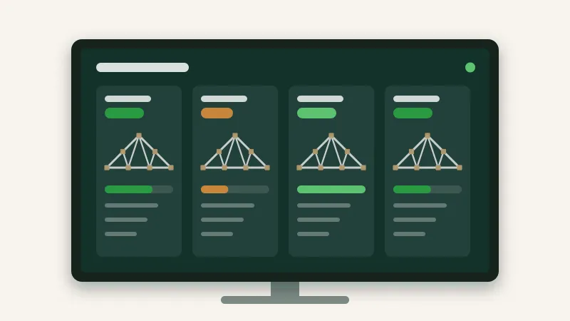
Crews are more likely to use a tool consistently when they see the result: progress against today's goal, points adding up toward a bonus, a TV showing what each crew is building. When tracking feeds something they care about, it stops feeling like paperwork.
Installing and updating an app on every phone and tablet is a chore, especially on personal phones. Web apps that run in the browser avoid that: share a link, and it works on any phone, tablet, computer or TV. Updates happen for everyone at once.
Before rolling anything out, try it where it'll be used:
If a tool fails these tests, it will fail on a busy Monday.
Shop-floor tools should be built for the phone first, with big, few buttons, plain words, high contrast and instant feedback. Remove passwords for simple single-purpose tasks, tolerate weak connections, avoid app installs, and show crews what their data does. Test everything where it'll be used, with the people who'll use it.
Every screen in Truss Plant Portal is built for a phone first, and builders use a simple crew link with three big buttons: Start, Pause and Done.
Spreadsheets got your plant this far. Here's how to move to something better in stages, without a big-bang switchover or a lost week.
4 min read
Shared passwords and everyone-can-edit spreadsheets are convenient until something goes wrong. Here's a practical way to give each person the access their job needs.
4 min read
A TV on the shop wall can save dozens of walks to the office every day, or it can become expensive wallpaper. The difference is what you put on it.
5 min read